 IB Docs (2) Team

Box and whisker plots
 One of the graphs that is very much underused in internal assessment is the "box and whisker plot." They are also called "box plots." This graph is a very good way of showing not only the median values of two or more conditions but also giving the reader a sense of the distribution of the data and the presence of outliers.
The box and whisker plot is now a part of all SL maths courses in the IB. Having students transfer that learning from maths to psychology will enrich their learning, helping them to see connections between their courses. And it will also provide students with a framework for interpreting their descriptive statistics.
What is a box plot?
A box plot is a visual display of five key descriptive statistics with regard to a data set - what is often called the five-number summary.
- the minimum value
- the lower quartile (Q1)
- the median (Q2)
- the upper quartile (Q3)
- the maximum value
The following is an example of a box plot.

When reading the graph, the vertical line in the middle of the blue box is the median. Looking at the graph, you can tell that the minimum score was 2 and the maximum was 9 with a median score of 5.5. If you take the value of Q3 [7.5] and subtract the value of Q1 [4.5] you have a measure of dispersion called the Interquartile range [IQR]. In this case, the IQR is 3.0.

In a normal distribution of data, the box plot would look like this. But as you will see, it is often either skewed to the right or to the left of the median - that is, the box is not very often evenly divided by the median and the "whiskers" are not the same length. So, by using a box and whisker plot, we can get a quick sense of the distribution of our data and whether we can say that the data is normally distributed. This is one of the key reasons that in IB psychology we often use the non-parametric tests like the Mann Whitney for independent samples and the Wilcoxon signed ranks for repeated measures.
When deciding whether a piece of data is an outlier or not, we follow a very simple rule. You multiply the IQR by 1.5. And then, you add that value to Q3 and subtract it from Q1.
In the graph above, are there any outliers?
- First, take the IQR [3.0] and multiply by 1.5. This gives us a value of 4.5
- Add the calculated outlier value [4.5] to the value of Q3 [7.5]. This means that any score above 12 would be considered an outlier and can be eliminated from your data. But our maximum value is 9, so there are no outliers on that side.
- Subtract the calculated outlier value [4.5] from the value of Q1 [4.5]. This means that any score below 0 would be considered an outlier and can be eliminated from your data. But our minimum value is 2, so there are no outliers on that side.
How to construct a box plot
You can design a box plot either by hand or by using a computer program.
When designing by hand, you start with the median of your data. Then to complete the box, you find the median of the data to the "left" and to the "right" of the median. This completes your box. To complete the whiskers, you mark the maximum and minimum values. From the minimum to the start of the box is called Quartile 1 and contains 25% of your data. From the left to the right side of the "box", this contains 50% of your data. And from the right side of your to the maximum score is also 25% of your data.
There are several online programs that can do this for you.
- Desmos - Directions for using the program can be found here.
- Displayr.com
- Good calculators
- Meta-chart
Interpreting a box plot
When carrying out a study in psychology, you will have two or more box plots. Box plots may be presented either horizontally or vertically. Let's look at a vertical representation just to mix things up a bit.
In the following experiment, let's say that there was a list of 16 song titles to remember. Group one was asked to remember the song titles while listening to a very popular song by a very popular artist. Group two was listening to a speech by Winston Churchill. Group 3 was the control group. Below you will see the three box plots representing the data. What can we tell about the data, just by looking at this graphic representation?
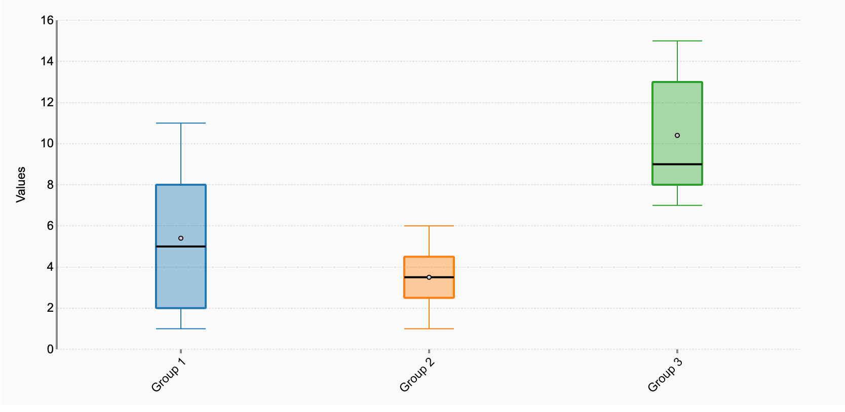
By taking a quick look at the data above, can we determine whether the data might be significant? And if so, how? There are two quick tips for seeing if your data is likely to be significant.
Start with the boxes. They represent the interquartile range. If two boxes do not overlap with one another, then there is a difference between the two groups. You can see that there is a clear difference in the data between groups 1 & 3 and groups 2 & 3.
Compare the medians. If the median line of box 1 lies outside of box 2 entirely, then there is likely to be a difference between the two groups. You can see that in this case, groups 1 and 2 show no significant difference.
Critical thinking about box plots
The following box plot represents data from an experiment in taste and perception. In this experiment, participants were asked to drink a glass of cranberry juice. In the "congruent" condition, the guide was served with no change and the participants were asked to identify the flavour of the juice as quickly as they could. Cranberry juice was chosen as there are several red juices, meaning that there were several potential answers. In the "incongruent" condition, the colour of the juice was changed to green. In other words, the colour did not match the natural colour of the juice. The question is whether our taste is reliant on the colour of the juice in order to identify the flavour.
When students put the data into a box and whisker plot, they came up with the following data representation. What does this tell us about the data?
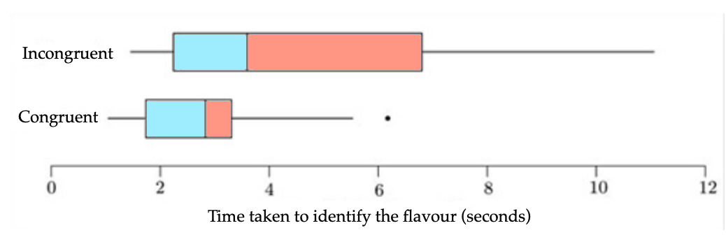
The first thing that should stand out is that the variance of the time taken in the "green juice" condition was much higher than in the red juice condition. The IQR (the box) is wider in the incongruent (green) than in the congruent (red) condition.
The boxes overlap, so we cannot assume that there is a significant difference between the conditions. However, we cannot rule out a significant difference because the median of the incongruent condition is not within the box of the congruent condition.
You can also see that both samples show skew. For the incongruent condition, there is right-skew, with a long tail to the right (high values), as shown by the longer right whisker and also by the fact that the right part of the box (median to upper quartile) is longer than the left part.
The dot to the right of the congruent box plot is an outlier. It appears that there is only one potential outlier in this sample. However, since the outlier falls within the box of the incongruent condition, it is not that extreme and most likely should not be eliminated from the data set.
 Twitter
 Facebook
 LinkedIn