Graphical analysis - skills for life!
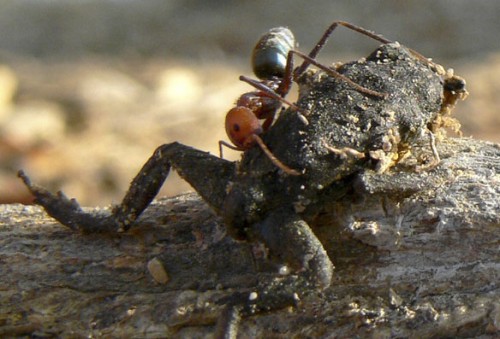 Evaluating whether data supports the hypothesis that Australian meat ants control the poisonous cane toad illustrates a challenging skill in Biology. Variability of biological materials often complicates a decision like this. Usually there is conflicting evidence and students have to estimate to what extent the data supports the claim, and then justify their answer. This is a short activity to help practise this important skill, useful in Biology and also in reading the news.
Lesson Description
Guiding Question
What do you have to look for to decide that a set of data supports an hypothesis?
Activity 1 - Australian meat ants control the poisonous cane toad!
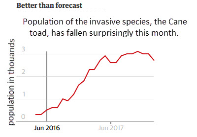
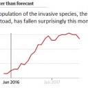
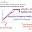
the latest weapon in Australia’s endless battle against the cane toad are the fierce Australian meat ants. Cane toads have bred rapidly over the last years and their millions-strong population is causing terrible ecological damage in most parts of Australia. The population of cane toads has been monitored since 2016. Australian meat ants were introduced into this area in June 2017.
Analyse this graph showing data about the Cane toad populations.

Answer the follwoing questions.
Questions
1. Describe the trend in the population of the cane toad shown in the graph.
................................................................................................................................
................................................................................................................................
................................................................................................................................
2. Evaluate the evidence that the Australian meat ants have caused he population of cane toad to fall in the last month.
................................................................................................................................
................................................................................................................................
................................................................................................................................
.
Activity 2 - Evaluation of evidence
An hypothesis is often suggested and then tested against experimental data which can support the hypothesis, or not.
How does a biologist go about deciding if the data supports the hypothesis?
What to do:
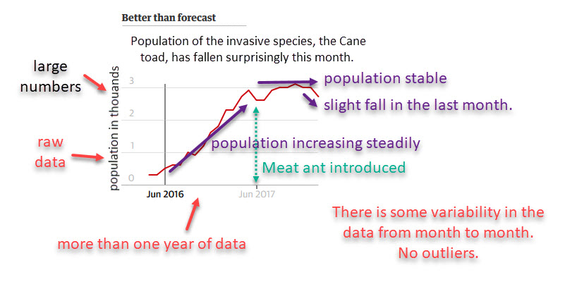
Carefully examine the axes and legends.
Identify if the graph is showing raw data, averages or something else?
Scan over the whole graph, decide what it is saying
Check, "Do I understand this graph?"
Annotate the trends if possible.
What to look for:
Are the scales on the graph regular?
Is there an overall pattern in the data - lines or curves showing trends?
Are there any changes in the trend?
How much data is represented? - More data is usually more reliable.
How variable in the data presented? Are the points close to the best fit line?
Are there any individual outliers in the data set?
What to decide;
How strong is the relationship between the variables?
Does the relationship support the hypothesis, or not?
Does part of the data support the hypothesis, and part of the data not support the hypothesis?
Could there be any methodological problems which may cast a doubt about the data?
Is there a "Lurking variable", not included in the data presented but which may affect both the variables shown?
The evaluation of this graph could include these ideas:
- the cane toad population has remained constant since the introduction of the meat ants, which supports the idea that the meat ants are causing the cane toad population to be lower.
- The variability of the data is about the same as the last month's fall, which does not support the suggestion that there is a "surprising fall" in cane toad numbers.
- A fall in cane toad numbers also took place before the meat ant introduction which does not support the hypothesis that the meat ants are causing the fall in cane toad numbers.
- There could be 'lurking variables' such as weather, availability of food or other cane toad control methods in use in the area, which raises doubts about the claim.
Activity 3 - Further examples
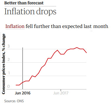
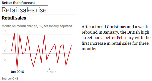
These graphs show data with makes a claim about a conclusion which might be drawn from the data.
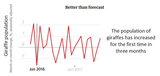
Evaluate the extent to which each set of data supports the conclusion suggested using the ideas above.
In a study of giraffe populations in a national park.
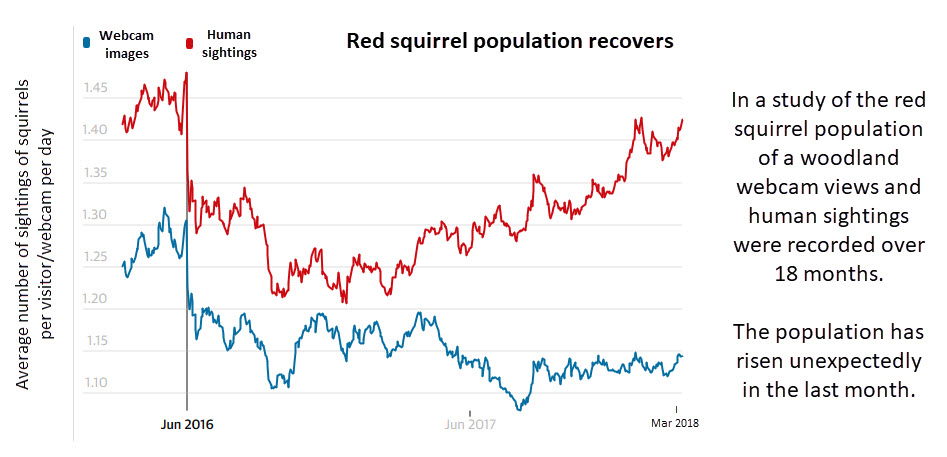
In a study of red squirrel populations in a woodland nature researve.
Teacher's notes
Activity one gives students a short exercise to try analysing the cane toad graph.
Then activity two illustrates how this could be done in detail. A series of questions could be used as prompts to help students improve their first analysis.
The third activity is an opportunity to practice these skills in two more graphs.
Skills for life
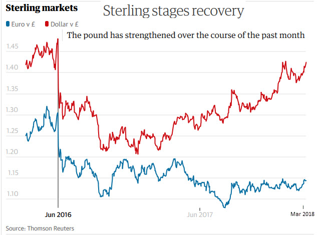
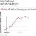
These graphs have appeared in the press recently in articles about the economy.
The skill of analysis of this data will enable students to identify exaggerated claims, and errors in the headlines in news papers. The original source of these graphs is The Guardian newspaper, UK.

 IB Docs (2) Team

