 IB Docs (2) Team

Describing trends in IB graphs
Describing the data on a graph is a skill in Biology. Achieving the marks in an IB exam is more difficult that it looks. Students must do exactly what the question asks and give precise details in their answers.
It is important to understand the command terms. They have specific meanings in IB exams.
Command terms commonly found in graph questions.
| State | Give a specific name, value or other brief answer without explanation or calculation. |
| Measure | Obtain a value for a quantity. |
| Calculate | Obtain a numerical answer showing the relevant stages in the working |
| Describe | Give a detailed account. |
| Distinguish between | Make clear the differences between two or more concepts or items. |
| Compare | Give an account of the similarities between two (or more) items or situations, referring to both (all) of them throughout. |
| Compare and contrast | Give an account of similarities and differences between two (or more) items or situations, referring to both (all) of them throughout. |
| Analyse | Break down in order to bring out the essential elements or structure. |
Look at these examples of graphs below and try to answer the questions.
This first example is a simple bar chart. It is rare to have something this easy in an IB exam.
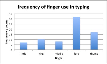
- State which finger has the highest frequency use in typing?
Fore (finger)
- don't say 'first finger', even though you know that this is the same thing, it is not obvious that you mean 'fore' and you might mean the first one on the graph ie: 'little'
Hint #1: Always use the words exactly as they are written on the graph.
- Compare and contrast the frequency of use of the three fingers, 'Little', 'ring' and 'middle'.
Similarity - all three fingers have a lower frequency of use than fore finger or thumb.
Difference - little finger has the lowest frequency of use, the middle finger has a slightly higher frequency of use than the little finger, and the ring finger has a slightly higher frequency of use than the little and middle fingers.
Hint #2: In a 'compare and contrast' question you should look for a similarity and a difference.
Hint #3: When comparing you must mention at least two fingers in each comparison.
- Analyse the hypothesis that most people type with just two fingers.
The data supports the hypothesis because most of the typing frequency is done by the fore finger and thumb.
The data doesn't support the hypothesis because all five fingers are used in typing.
Hint #4: It is important to bring out the essential elements.
There may be evidence to support and refute the hypothesis.
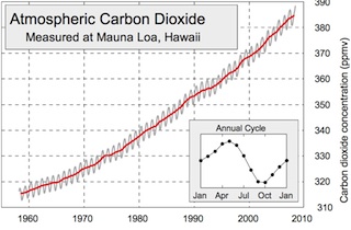
- Describe the general trend in carbon dioxide concentration between 1960 and 2012 shown in the graph above.
As the Years increase from 1960 to 2010 the carbon dioxide concentration increases.
The rate of increase is also gradually increasing as the line gets gradually steaper.
Hint #5: The first general trend can often be stated using this model:
As the ___________________ increases from _______ to ________ the _________________ (increases / decreases)
Hint #6: Look for more subtle trends too, like a curve in the line, or a plateau, or a maximum peak.
- Measure the size of the annual fluctuation shown by the black line on the main graph.
The value should be close to 7 ppmv. ( 6 or 8 would be acceptable, but 5 would definitely be too small and 10 too large)
Hint #7: Measure this carefully, use a ruler and trace lines on the graph. Don't round up your answer to fit the axis scale.
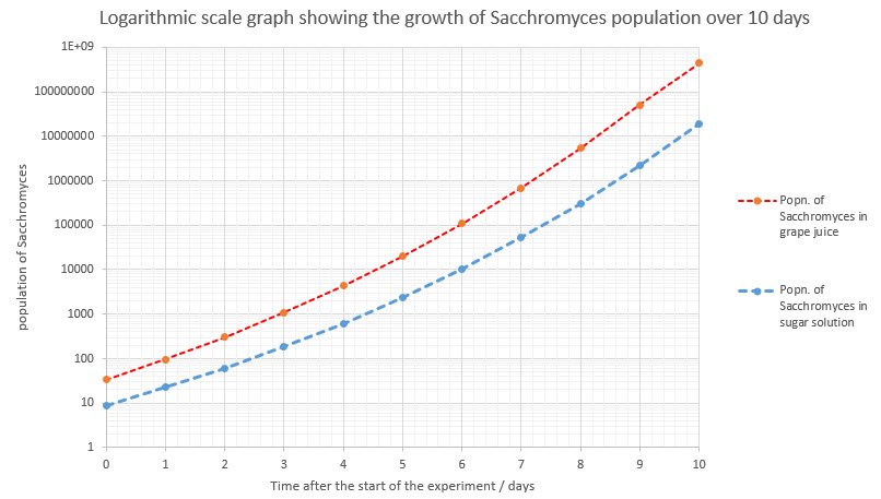
- Describe the growth in the population of Sacchromyces in grape juice in the graph above.
As the time after the start of the experiment increases the population of Sacchromyces increases, for the whole of the experiment.
The rate of increase is exponential / it gets increasingly rapid as the population rises.
Hint #8: Take careful notice of the axis. This looks like a constant rate but the scale is logarithmic.
The same graph with a linear scale would look like this: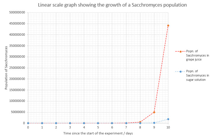
 Twitter
 Facebook
 LinkedIn