
 Looking at the Spread of Data - This topic is all about these two related tools for helping us look at how a data set is spread out. Learn about filling in cumulative frequency tables, plotting the corresponding curves and using the curves to draw box plots and answer questions about the data set. See below for some short, specific video lessons, some revision slides and practice questions.
In this unit you should learn to...
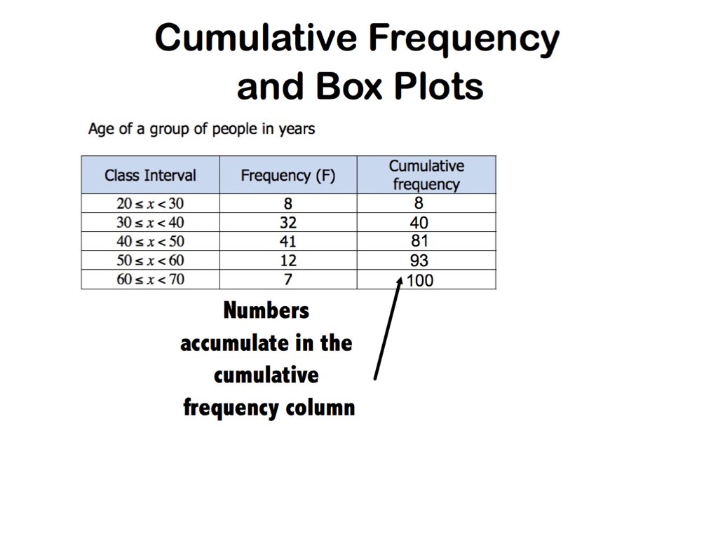
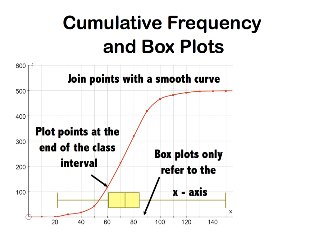
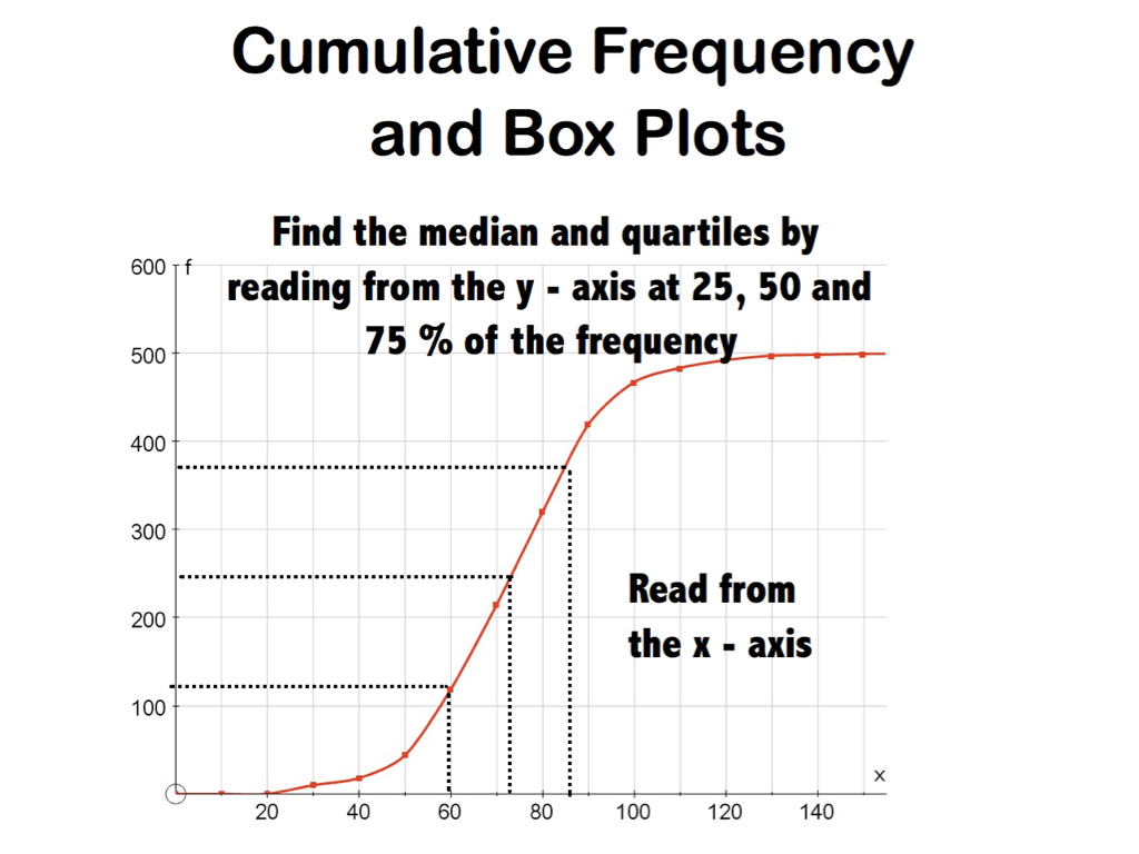
- Construct cumulative frequency tables and diagrams
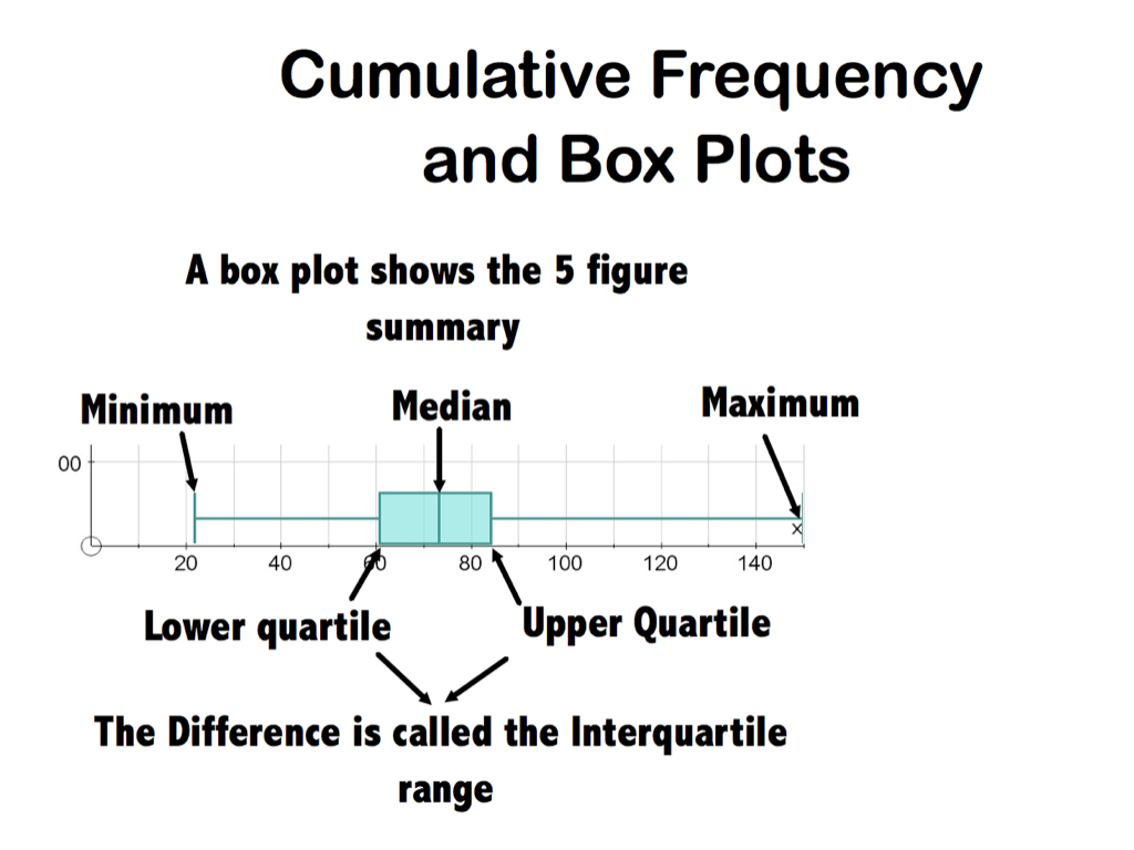
- Use them to find the median, quartile, percentiles, range and Interquartile range
- Produce and understand box plots
- Use all of the above to describe, interpret and compare data sets
Slide Gallery
Look at the topic at a glance with these overview slides about cumulative frequency and box plots


Video Lessons
This section offers a series of video tutorials on this topic. They are carefully paced and ordered to help you step by step through the idea. You can use them to teach yourself from scratch or to review all or any part of the topic as and when you need to.


Self Checking Quiz
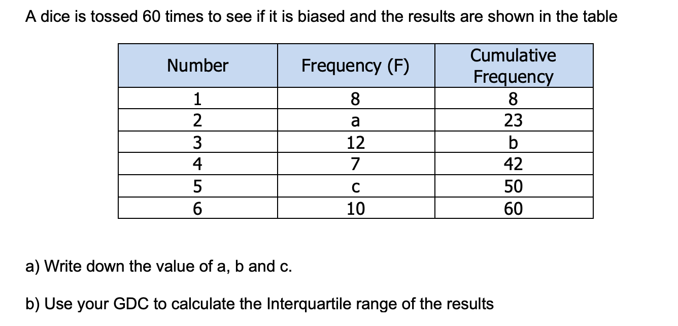
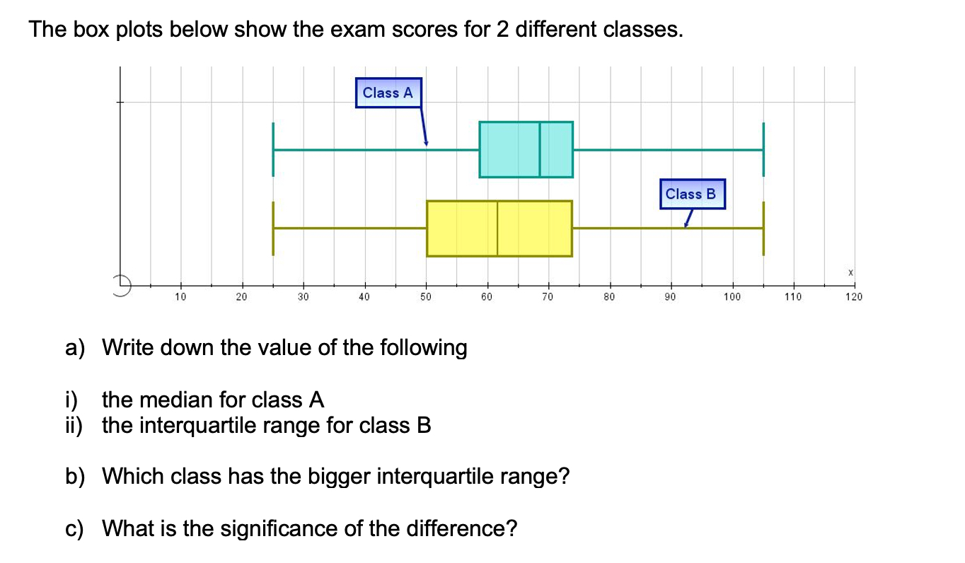
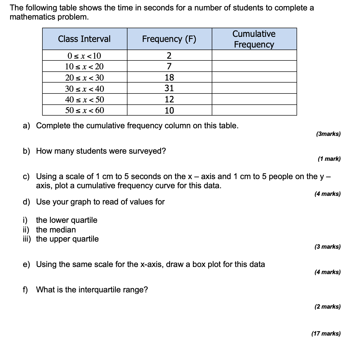
Practice your understanding on these quiz questions. Check your answers when you are done and read the worked solutions when you get stuck. If you find there are still some gaps in your understanding then go back to the videos above.


MY PROGRESS
How much of 4.2 & 4.3 Cumulative Frequency & Box Plots have you understood?
 Twitter
  Facebook
  LinkedIn