
If the first two examination sessions have told us anything, it is that you - the students - need to be equipped to deal with analysing infographics. Here you'll see some examples of infographics dealing with global issues, and you'll receive guidance on how to respond to them.
What do we need to know about infographics?
The examiners of this course are always more interested in your interpretative skill - and your ability to read, think and explain your ideas of how the text creates meaning - than whether you can regurgigate terminology you have learned by heart. While it is certainly helpful if you can talk technically about presentational tools and features, don't let this get in the way of your attempts to connect style with thematic meaning.
What we do know is that both texts in Paper 1 will have visual elements, and one of them will be predominantly visual. In the first two examination sessions, these texts have been infographics.
Take a good, long look at the following infographic text, and try to answer the questions below:
Discuss how the different features are used in this infographic to achieve the author's purpose.
Infographic Quiz
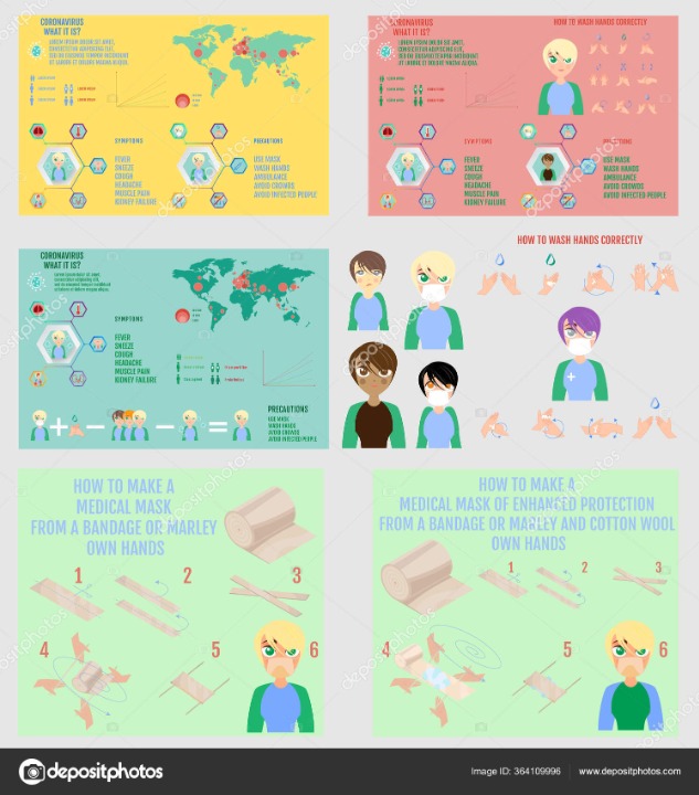
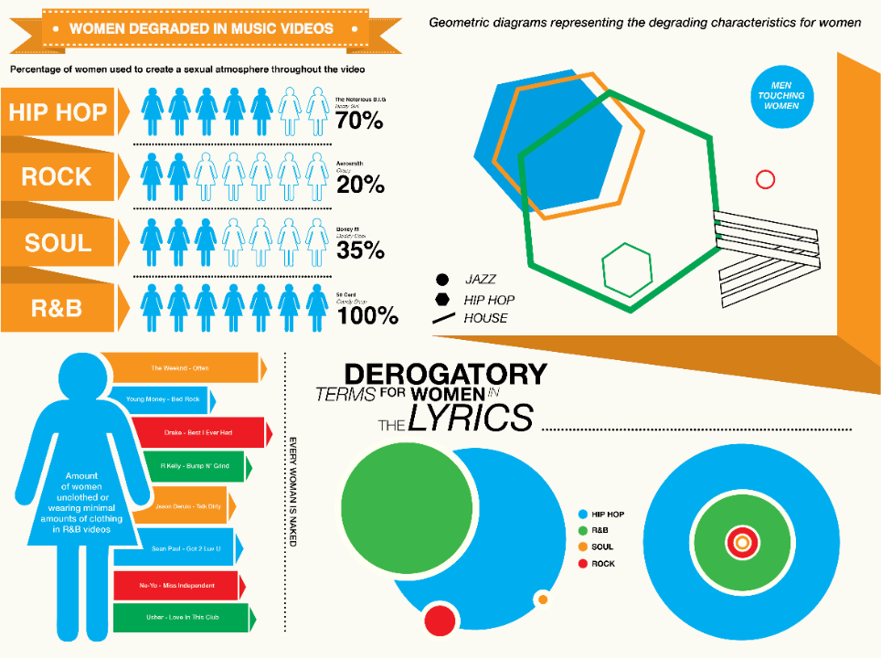
What is the global issue being explored in this text?
This text explores social media and its impact upon people and society. It attempts to look at it in a balanced way, but recognises some of the universal and transnational ideas of internet and privacy. However, it is more of a checklist of the usability of different large social media brands, as opposed to a discussion of the problems of social media in a human or social sense.
What techniques are used in this text? (check all that apply)
Select the 6 correct answersThe main character is presented as the person considering the different social media options - and there is a certain amount of emotion presented in his face as he thinks about all of this. However, despite appearing balanced and hinting at some of the issues, it acts more of a buyer's checklist than a real consideration of a global issue. The text uses many visual elements to make it appealing, but it is more asking, 'What is your platform of choice?' rather than, 'Should you choose any platforms at all?'
Model Response
Whether you be a passionate supporter of how it connects people, or an executive of Silicon Valley who openly keeps your own children away from screens, there is no doubt that social media has significantly changed global societies and how people live and interact with each other. These ideas are explored further in Click.co.uk's infographic entitled, 'The pro's and con's of social media'. Through presentational textual features and icons evaluating positives and negatives, this infographic presents a balanced look at different social media platforms and considers the broader value of social media itself.
The text centres around the face of a person considering which social media platform to use. The character has a simple, emoji-style face, and around his head is a semi-circular rainbow of different social media platform options, each given an equal-sized segment symmetrically presented. Using the rule of thirds, the bottom horizontal third encompasses this character, with the pro's and con's of each platform dominating the upper two-thirds of the infographic. The title of the piece - suggesting a serious consideration of social media as a concept rather than merely 'which platform should I use' - is in the top-right on a bold red background, while the organisation's name is presented through an illustration of a mobile phone in the top-left. Using key social media language, the message of the text is presented in the hashtag #itsheresomewhere, implying that the different platforms together account for all that is needed. This is enhanced by the message, 'You're all amazing.'
Click employs social media platform icons alongside smaller thumbs-up and thumbs-down icons (using traffic-light reds and greens to symbolise positives and negatives) in order to present a balanced discussion of the pro's and con's of social media. Despite never naming the social media platforms, the different options such as LinkedIn, Facebook, Twitter, and YouTube are presented through their commercial icons and symbols. This could be seen as causing confusion in an infographic aiming to clarify, however, given that this infographic itself woud be found online, it would be easy enough to find which platform is being discussed. The main content of the infographic is in the thumbs-up and thumbs-down text. For the most part, it is fairly trivial and pragmatic, including positives such as, 'Simple to use,' 'Images are hyperlinked to their original source,' and 'Easy to find people and discover people to follow,' but there are some deeper points made about the very nature of social media and how it is designed to make communication and notification easy - 'Each to search network for content using hashtags' - thus achieving the main marketing goal of gaining and maintaining users. Within the thumbs-down section, there are some similarly practical comments such as Google+ having a 'lack of market share' or for Instagram 'links don't work in captions', but there is the very barest of suggestions of broader conceptual concerns about social media per se and its issue on a global scale: Facebook has 'privacy issues', which is of major concern, and Twitter's 'short messages can be limiting', perhaps beginning to suggest that social media is reducing our capacity for longer forms of communication, nuanced thinking, and creating more polarised and binary positioning on so many issues in the world.
Despite some suggestion in the negative comments on the different platforms, it's clear that this infographic isn't, as it promises to be, a guide to the pro's and con's of social media, but instead is a piece that suggests that 'all' platforms are 'AMAZING' and there's something for everyone if you combine the platforms and consider the technical challenges of each. In this way, it's more of a user's guide to the largest social media platforms rather than a social commentary on the very essence of social media and its impact upon people and societies globally.
Your Turn
Now you try. Take a look at the following infographic:
1. What is thematic message and the global issue being discussed in this infographic?
2. Which textual features of the infographic do you think should be commented on?
3. Write a guiding question or statement to frame your response.
4. Write a model answer and send it to me for feedback.
Using the model analytical structure consistently presented throughout this site, here is a model response to the November 2021 Paper 1 infographic. This student did this in controlled conditions in preparation for the May 2022 session, before acing that session and gaining a strong Level 7, not only in Paper 1 but also overall. Here is their model response:
In times of social media and the ubiquitous presence of rapid communication technologies, time always appears to be of the essence, which too often undermines the benefit of simple matters. The concept of humour epitomises this notion and the infographic from the website of Humor That Works attempts to depict this issue. Through the juxtaposition of colour, use of imagery and sustained appeal to ethos, the author intends to galvanise the audience into action, in order to facilitate change with regards to the use of humour at work.
Firstly, the author juxtaposes multiple shades of blue with a washed-out shade of orange to establish a contrast in mood. In terms of content, the blue shade depicts the benefits of humour, whilst the seemingly drab shade of orange quantifies the hesitancies of the general public. This adds a connotation of positivity and optimism to the shades of blue, whilst it characterises the tone of orange as a barrier of negativity. This allows the author of this infographic to depict a sensual narrative, which follows a simple narrative arc. The reader is firstly introduced to the benefits of humour at work, yet subsequently confronted with the barriers of fear and negativity that hinder this ideal. At the bottom of the infographic optimistic solutions are then proposed to counter the monotonous mood at work. This basic storyline is emphasised through the juxtaposition of the drab orange shade and comparatively bright tone of blue; in the second half of the infographic, it is evident that the proportion of orange colour progressively decreases, which sensually buttresses the idea of the barriers towards humour being conquered, in attempt to encourage the audience to embrace the mood portrayed by striving to facilitate the more widespread use of humour at their workplace.
Furthermore, the infographic sustains an appeal to ethos through the use of a myriad of statistics, as well as the juxtaposition of paratactic and hypotactic sentences. At the bottom of the infographic, a detailed account of the importance of humour with regards its human relationships is offered. The infographic informs the reader that ‘humour helps connect people by building trust, reducing status differentials, diffusing conflict, and creating positive shared experiences that bring us closer together’. This quote is characterised by the use of asyndeton and the first person plural pronoun to establish a basis of credibility for the assertions in the infographic. Through the use of the first person plural pronoun, the power relationship between the author of the infographic and the audience is levelled to avoid a patronising tone, which would discourage the audience from embracing the advice of the infographic and taking action. Moreover, the deliberate use of asyndeton allows for the juxtaposition of a hypotactic sentence with a series of paratactic sentences bove, such s ‘Humour can increase happiness by up to 42%’ or ‘Americans feel stressed about their jobs’, which enhances the credibility of the author by proving a certain degree of formal technocracy. The juxtaposition of various sentence lengths also allows the author to appeal to a cast audience, whilst supplementing his call for humour with personal aspects. The top of the infographic is dominated by generalisations, such as ‘Americans are unsatisfied with their job’, which is utterly necessary to engage a large and diverse audience, yet in combination with the use of the ‘first person plural pronoun ‘us’, the audience is directly engaged, which reflects the author’s intention of galvanising the audience into action on a personal level.
In addition, the infographic employs the use of imagery to disseminate an optimistic tone, whilst remaining realistic to galvanise the audience into action. The top of the infographic is characterised by unsatisfied facial expresson, which is contrasted with the first imagery at the bottom. In contrast, the facial expressions above, the fists imply a sense of power and force, which re-emphaises the sensual storyline depicted by the means of colour. The fists highlight how the doubts and aversions to humour have been overcome by portraying a tone of conviction, which suggests that the audience has the power to overcome the negativity that is holding it back to implement the more widespread use of humour at work. Therefore, the author employs the use of imagery to appeal to the audience on a sensual level, in an attempt to persuade it that imminent action is crucial.
Overall the infographic employs the interplay of text and image to convince the audience to take action in a multi-faceted manner. Whilst ethos is used to affirm the credibility of the infographic, colour and imagery are also utilised to hook the reader by conveying a sensual narrative, which remains realistic by depicting the barriers that exist, yet ultimately depicting an optimistic mood to encourage the audience to take action.
Feedback
Which of the following best describes your feedback?